
Data visualization plays an important role in data analysis workflows. It enables data analysts to effectively discover patterns in large datasets through graphical means, and to represent these findings in a meaningful and effective way. Data visualization is an interdisciplinary field, which requires design, web development, database and coding skills.
The goal of this tutorial is to introduce the building blocks for creating a meaningful interactive data visualization. To do this, we will use a dataset from DonorsChoose.org to build a data visualization that represents school donations broken down by different attributes. We will be covering a wide range of technologies: MongoDB for storing and querying the data, Python for building a web server that interacts with MongoDB and serving html pages, Javascript libraries d3.js, dc.js and crossfilter.js for building interactive charts. By the end of this tutorial, you will get enough knowledge that you can leverage for other projects that require interactive data visualization.
The source code for this tutorial can be found in this github repository.
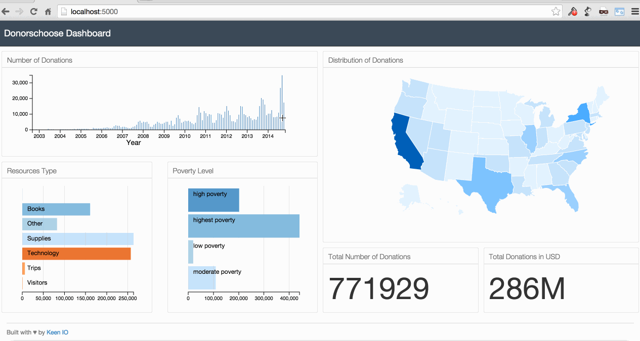
Below is an animated gif of the interactive data visualization dashboard that we will be building in this tutorial.
1. The case study
DonorsChoose.org is a US based nonprofit organization that allows individuals to donate money directly to public school classroom projects. Public school teachers post classroom project requests on the platform, and individuals have the option to donate money directly to fund these projects. The classroom projects range from pencils and books to computers and other expensive equipments for classrooms. In more than 10 years of existence, this platform helped teachers in all US states to post more than 7700,000 classroom project requests and raise more than $280,000,000. DonorsChoose.org is making the platform data open and available for making discoveries and building applications. In this tutorial we will be using one of the available datasets for building an interactive data visualization that represents school donations broken down by different attributes.
Getting and understanding the data
DonorsChoose.org data is available on this url. We will be using the “project” dataset. This dataset contains information about all classroom projects that have been posted to the site. This dataset can be downloaded directly from this url.
After downloading and unziping the data, we will get a file called opendata_projects.csv with a size of around 324MB (at the time of writing). The data is represented in csv format. csv stands for "comma-separated values". csv files are used for storing tabular data and its metadata. These files can be open by any standard text editor, or more conveniently by spreadsheet application like Microsoft Excel or Google Spreadsheet.
This file contains 771,929 records along 44 attributes. In this tutorial, we will be using only 5 attributes, namely school_state, resource_type, poverty_level, date_posted and total_donations. Below is the first record along the 5 attributes.
- school_state: NY
- resource_type: Technology
- poverty_level: highest poverty
- date_posted: 2002-11-11
- total_donations: 329.00
2. Storing and querying the data: A crash course in MongoDB
Now that we have our dataset, we will store the data into a database called MongoDB. MongoDB is the most popular non-relational database. Relational databases represent data in rows and columns (similar to a spreadsheet). In relational databases, we have to specify the data schema in advance. Furthermore, relational database don’t scale very well. In contrast, MongoDB is a schemaless database, which provides more flexibly in storing records of different formats in the same database. mongoDB scales very well. However, it doesn’t support joins and transactions that relational databases provide. MongoDB stores data in BSON format (similar to JSON), which stands for Binary JSON. JSON stands for JavaScript Object Notation. This format makes it easy to humans to read the data, and for machines to parse it.
MongoDB can be used with all major operating systems. The installation guides can be found in this page.
Storing the data in MongoDB and running queries from a mongo shell
The commands that follow are run on Mac OS. For Windows or other operating systems users, the commands shouldn’t be that different. If you have any problem executing the commands, leave a message in the comments section at the end of this page.
After installing MongoDB, open a Terminal window, and run the command below to start the database.
$ mongodb
Next, open another Terminal window, go the folder where you stored the dataset, and run the command below to copy the dataset to MongoDB. The data will be stored in a database called donorschoose under a collection called projects.
$ mongoimport -d donorschoose -c projects --type csv --file opendata_projects.csv —headerline
Next, run the command below to start a mongo shell. This mongo shell allows us to interact with the database and query the data.
$ mongo
In the mongo shell, run the command below to choose the database donorschoose.
> use donorschoose
Next run the command below to return all collections that are stored in donorschoose DB. This will return projects since it’s the only collection that we stored inside donorschoose DB.
> show collections
Next run the command below to retrieve one random record from the donorschoose DB.
> db.projects.findOne()
The command above returns the following record with 45 key-values. 44 key-values are from the original data, and the key "_id" with its value is a unique id assigned automatically by MongoDB.
{"_id" : ObjectId("54954c1441606439933b93d8"), "_projectid" : "\"e565fb42185c6e9f22806ad9d5ac8a77\"", "_teacher_acctid" : "\"2e17c8c91cb58132d8103a9aa8797e80\"", "_schoolid" : "\"45e7ddbdd7023f1eb65a6cc028d7414f\"", "school_ncesid" : NumberLong("360009001332"), "school_latitude" : 40.841691, "school_longitude" : -73.875457, "school_city" : "Bronx", "school_state" : "NY", "school_zip" : 10460, "school_metro" : "urban", "school_district" : "New York City Dept Of Ed", "school_county" : "Bronx", "school_charter" : "f", "school_magnet" : "f", "school_year_round" : "f", "school_nlns" : "f", "school_kipp" : "f", "school_charter_ready_promise" : "f", "teacher_prefix" : "Mr.", "teacher_teach_for_america" : "f", "teacher_ny_teaching_fellow" : "f", "primary_focus_subject" : "Literacy", "primary_focus_area" : "Literacy & Language", "secondary_focus_subject" : "", "secondary_focus_area" : "", "resource_type" : "Books", "poverty_level" : "highest poverty", "grade_level" : "Grades 9-12", "vendor_shipping_charges" : "", "sales_tax" : "", "payment_processing_charges" : "", "fulfillment_labor_materials" : "", "total_price_excluding_optional_support" : 280.02, "total_price_including_optional_support" : 341.49, "students_reached" : 0, "total_donations" : 308, "num_donors" : 1, "eligible_double_your_impact_match" : "f", "eligible_almost_home_match" : "f", "funding_status" : "completed", "date_posted" : "2007-03-08", "date_completed" : "2007-03-08", "date_thank_you_packet_mailed" : "2007-03-08", "date_expiration" : "2003-12-31"}
In this tutorial, we are interested only the 5 attributes: school_state, resource_type, poverty_level, date_posted and total_donations. We can query one random record and return only these 5 attributes by running the following command.
> db.projects.findOne({}, {school_state:1, resource_type:1, poverty_level:1, date_posted:1, total_donations:1, funding_status:1, _id:0})
This returns {"school_state" : "NY", "resource_type" : "Books", "poverty_level" : "highest poverty", "total_donations" : 308, "funding_status" : "completed", "date_posted" : "2007-03-08"}.
We can get all records with the 5 attributes by running the following command.
> db.projects.find({}, {school_state:1, resource_type:1, poverty_level:1, date_posted:1, total_donations:1, funding_status:1, _id:0})
Interacting with MongoDB using Python
In the previous section, we queried MongoDB database using the mongo shell. Next, we will do the same by using python programming language. Understanding how to query MongoDB using python is important because we’re planning to build our server using python, and we will include within the server code MongoDB queries.
We will be using Python 2.7 and a Python library called PyMongo for connecting to MongoDB and querying the data. You should install Pymongo first before executing the commands below.
Start a python shell by running the command below from your Terminal window.
$ python
Next import the Connection method from PyMongo by running the command below. This method will allow us to connect to MongoDB and query the data.
>>> from pymongo import MongoClient
Next, we will define 4 variables that represent respectively MongoDB IP address, MongoDB port, MongoDB database name and MongoDB collection name.
>>> MONGODB_HOST = 'localhost'
>>> MONGODB_PORT = 27017
>>> DBS_NAME = 'donorschoose'
>>> COLLECTION_NAME = 'projects'
Next, we will define the 5 attributes that we will use for our query. Note that we had to explicitly set the records unique id _id to False. If we don't do so, it will be included in the query's response.
>>> FIELDS = {'school_state': True, 'resource_type': True, 'poverty_level': True, 'date_posted': True, 'total_donations': True, '_id': False}
And finally, let's connect to MongoDB and retrieve all the records along the 5 attributes that we are interested in. We can do so by running the following.
>>> connection = MongoClient(MONGODB_HOST, MONGODB_PORT)
>>> collection = connection[DBS_NAME][COLLECTION_NAME]
>>> projects = collection.find(projection=FIELDS)
All the records are stored in projects, we can print all them by running the following command.
>>> for project in projects:
>>>     print project
2. Building the server
For this tutorial, we will be using Python Flask for building a server that interact with MongoDB and render the html page that contains our charts. Flask is one of the most popular web frameworks for Python. It’s minimal and very easy to learn. Flask installation guidelines can be found in this url.
We start by creating a folder called project. Inside the project folder, we create a folder called templates, and inside the templates folder we create an html file called index.html.
Inside the index.html page, copy the code below.
<h1>Hello World!</h1>
Next, we create another file called app.py inside the project folder. We copy the code below inside the app.py file. This is server side code.
from flask import Flask
from flask import render_template

app = Flask(__name__)

@app.route("/")
def index():
    return render_template("index.html")

if __name__ == "__main__":
    app.run(host='0.0.0.0',port=5000,debug=True)
From a Terminal window, go to the project folder, and start the server by running the following command.
$ python app.py
Now, if you open a browser and go to http://localhost:5000/, you will see the message Hello World!.
Next, we will modify the app.py folder to include the MongoDB query to retieve all the records from MongoDB along the 5 attributes. You can see many lines of code from the previous MongoDB section. We added one route decorator @app.route("/donorschoose/projects") to map the URL /donorschoose/projects to the data from MongoDB.
from flask import Flask
from flask import render_template
from pymongo import MongoClient
import json
from bson import json_util
from bson.json_util import dumps

app = Flask(__name__)

MONGODB_HOST = 'localhost'
MONGODB_PORT = 27017
DBS_NAME = 'donorschoose'
COLLECTION_NAME = 'projects'
FIELDS = {'school_state': True, 'resource_type': True, 'poverty_level': True, 'date_posted': True, 'total_donations': True, '_id': False}

@app.route("/")
def index():
    return render_template("index.html")

@app.route("/donorschoose/projects")
def donorschoose_projects():
    connection = MongoClient(MONGODB_HOST, MONGODB_PORT)
    collection = connection[DBS_NAME][COLLECTION_NAME]
    projects = collection.find(projection=FIELDS)
    json_projects = []
    for project in projects:
        json_projects.append(project)
    json_projects = json.dumps(json_projects, default=json_util.default)
    connection.close()
    return json_projects

if __name__ == "__main__":
    app.run(host='0.0.0.0',port=5000,debug=True)
If you start the server by running python app.py and go to http://localhost:5000/donorschoose/projects, you will see all the projects data printed in the browser.
3. Front-end side preparation
Now that we have the server side code and the MongoDB query ready, we will start building the front end code. We will be using a great responsive dashboard template from keen.io. keen.io templates provide the skeleton for analytics dashboards. With these pre-built templates, we only need to focus on building the charts without spending much effort in customizing the layout. For this tutorial, I created a new layout based on keen.io Javascript and css libraries. The template can be found in this github repository.
For building the charts, we will be mainly using 3 Javascript libraries crossfilter.js, d3.js and dc.js.
- crossfilter.js is a Javascript library for grouping, filtering, and aggregating large datasets.
- d3.js is a Javascript library for controlling the data and building charts.
- dc.js is a Javascript charting library that leverages both crossfilter.js and d3.js, and makes the creation of highly interactive data visualization simple.
We will also be using Bootstrap which is a keen.io template dependency, and queue.js which is an asynchronous helper library for Javascript.
Below is the folder structure of our project.
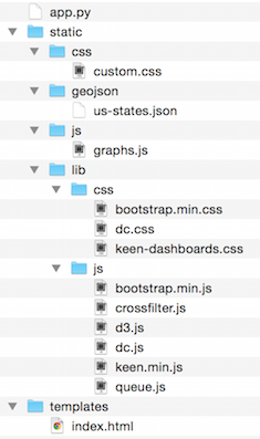
Note that the only files that we need to create from scratch are:
- app.py: Server side code for rendering html pages and querying MongoDB
- charts.js: Javascript file that will contain the code of our charts
- custom.css: css file that will contain our custom css code
We also need to make a few modifications to the index.html (keen.io template). Inside index.html, we need to define all the Javascript and css dependencies, and we need to reference the charts from charts.js.
4. Building the charts
We will write all the code for building the charts inside the chart.js file. We start by using a queue() function from the queue.js library. The lines that start with .defer are for reading the projects data and US states json file. Inside the .await function we call a function named makeGraphs that we define later. This allows us to read both the projects and US states json data in parallel, and wait for all the data to be read before executing the makeGraphs function. The makeGraphs function contains the code for cleaning the data, building the crossfilter dimensions for filtering the data, and the dc.js charts. It takes 3 arguments, the first one is error which can be used for handling any error from the the .defer functions, and as second and third arguments projectsJson, statesJson which contain the data that we read from the .defer functions.
queue()
    .defer(d3.json, "/donorschoose/projects")
    .defer(d3.json, "static/geojson/us-states.json")
    .await(makeGraphs);
function makeGraphs(error, projectsJson, statesJson) {
    ...
};
Inside the makeGraphs function, we start by cleaning the projects data. We change the date type from string to datetime objects, and we set all projects date days to 1. All projects from the same month will have the same datetime value.
var donorschooseProjects = projectsJson;
var dateFormat = d3.time.format("%Y-%m-%d");
donorschooseProjects.forEach(function(d) {
    d["date_posted"] = dateFormat.parse(d["date_posted"]);
    d["date_posted"].setDate(1);
    d["total_donations"] = +d["total_donations"];
});
Next, we create a Crossfilter instance.
var ndx = crossfilter(donorschooseProjects);
Next, we define our 5 data dimensions.
var dateDim = ndx.dimension(function(d) { return d["date_posted"]; });
var resourceTypeDim = ndx.dimension(function(d) { return d["resource_type"]; });
var povertyLevelDim = ndx.dimension(function(d) { return d["poverty_level"]; });
var stateDim = ndx.dimension(function(d) { return d["school_state"]; });
var totalDonationsDim  = ndx.dimension(function(d) { return d["total_donations"]; });
Next, we define 6 data groups.
var all = ndx.groupAll();
var numProjectsByDate = dateDim.group();
var numProjectsByResourceType = resourceTypeDim.group();
var numProjectsByPovertyLevel = povertyLevelDim.group();
var totalDonationsByState = stateDim.group().reduceSum(function(d) {
    return d["total_donations"];
});
var totalDonations = ndx.groupAll().reduceSum(function(d) {return d["total_donations"];});
Next, we define 3 values: The maximum donation in all states, the date of the first and last posts.
var max_state = totalDonationsByState.top(1)[0].value;
var minDate = dateDim.bottom(1)[0]["date_posted"];
var maxDate = dateDim.top(1)[0]["date_posted"];
Next, we define 6 dc charts. The first one is a bar chart that will show the number of projects by date. The second and third charts will show the number of projects broken down by the resource type and poverty level of school. The fourth graph will show a US map color-coded by the toal amount of donations for each US state. And the last two are numbers that will show the total number of projects and the total donations in USD.
var timeChart = dc.barChart("#time-chart");
var resourceTypeChart = dc.rowChart("#resource-type-row-chart");
var povertyLevelChart = dc.rowChart("#poverty-level-row-chart");
var usChart = dc.geoChoroplethChart("#us-chart");
var numberProjectsND = dc.numberDisplay("#number-projects-nd");
var totalDonationsND = dc.numberDisplay("#total-donations-nd");
For each chart, we pass the necessary parameters.
numberProjectsND
    .formatNumber(d3.format("d"))
    .valueAccessor(function(d){return d; })
    .group(all);

totalDonationsND
    .formatNumber(d3.format("d"))
    .valueAccessor(function(d){return d; })
    .group(totalDonations)
    .formatNumber(d3.format(".3s"));

timeChart
    .width(600)
    .height(160)
    .margins({top: 10, right: 50, bottom: 30, left: 50})
    .dimension(dateDim)
    .group(numProjectsByDate)
    .transitionDuration(500)
    .x(d3.time.scale().domain([minDate, maxDate]))
    .elasticY(true)
    .xAxisLabel("Year")
    .yAxis().ticks(4);

resourceTypeChart
    .width(300)
    .height(250)
    .dimension(resourceTypeDim)
    .group(numProjectsByResourceType)
    .xAxis().ticks(4);

povertyLevelChart
    .width(300)
    .height(250)
    .dimension(povertyLevelDim)
    .group(numProjectsByPovertyLevel)
    .xAxis().ticks(4);

usChart.width(1000)
    .height(330)
    .dimension(stateDim)
    .group(totalDonationsByState)
    .colors(["#E2F2FF", "#C4E4FF", "#9ED2FF", "#81C5FF", "#6BBAFF", "#51AEFF", "#36A2FF", "#1E96FF", "#0089FF", "#0061B5"])
    .colorDomain([0, max_state])
    .overlayGeoJson(statesJson["features"], "state", function (d) {
        return d.properties.name;
    })
    .projection(d3.geo.albersUsa()
                .scale(600)
                .translate([340, 150]))
    .title(function (p) {
        return "State: " + p["key"]
                + "\n"
                + "Total Donations: " + Math.round(p["value"]) + " $";
    })
And finally, we call the renderAll() function for rendering all the charts.
dc.renderAll();
Within the index.html file, we have to reference all the charts that we defined in the charts.js file. For example, if we want to show the US map chart, we have to add the line below to the index.html file.
<div id="us-chart"></div>
Conclusion
In this tutorial, I introduced the building blocks for building an interactive data visualization. The lessons learned from this tutorial can be easily leveraged for other projects that require similar interactive visualization.
All source code from this post can be found in this github repository.
Go Top
comments powered by Disqus