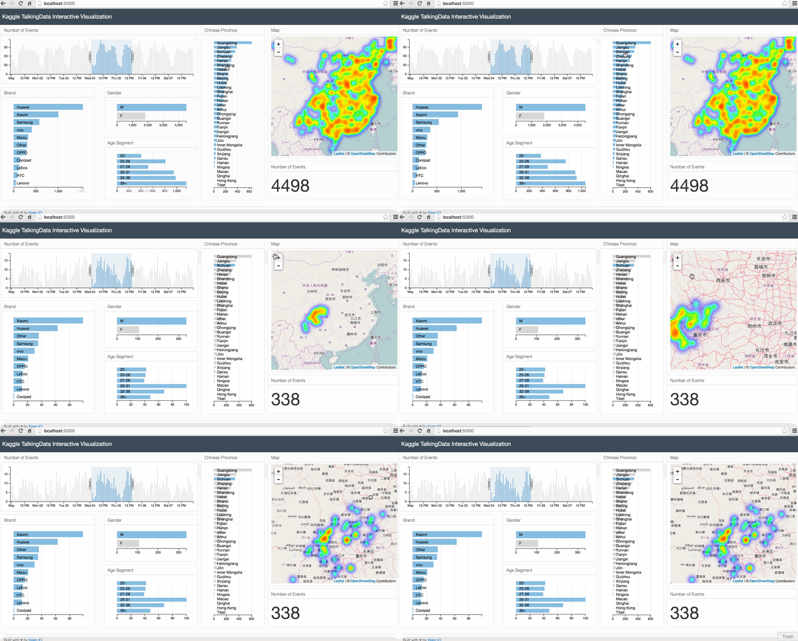
The goal of this tutorial is to introduce the steps for building an interactive visualization of geospatial data.
To do this, we will use a dataset from a Kaggle competition to build a data visualization that shows the distribution of mobile phone users in China. We will also create additional charts that show the usage patterns, the most popular phone brands, and users’ age segments and gender. We will be able to filter the data by the different attributes and see the results reflected in the map and all charts.
We will cover a wide range of technologies in this tutorial: Pandas for cleaning the data, Flask for building the server, Javascript libraries d3.js, dc.js and crossfilter.js for building the charts and Leaflet.js for building the map.
The source code for this tutorial can be found in this github repository.
Below is an animated gif of the interactive data visualization dashboard that we will be building in this tutorial.

1. The Case Study
In this tutorial, we will use a dataset from a Kaggle competition called "TalkingData Mobile User Demographics". This dataset is provided by TalkingData, China’s largest third-party mobile data platform. It contains app usage data, geolocation data and mobile device properties.The goal of the competition is to predict the gender and age segments of users based on the data provided.
Data visualization is an important first step in the data analysis workflow. It enables us to effectively discover patterns through graphical means, and to represent these findings in a meaningful and effective way.
The dataset that we will use contains various attributes that can be combined together to build interesting data visualizations. Geospatial data is particularly interesting, as it allows us to see how the user profiles and usage behavior changes based on the location.
In this tutorial, we will build a data visualization that combines a map that shows user locations together with various charts that summarises users’ information and usage behavior. We will make this visualisation interactive, so we can drill down into a particular user segment or location.
2. System Architecture
For our data visualization, we need a system architecture that handles the following:
- Cleaning and structuring data for visualization. We will use mainly Python’s Pandas library for this.
- Serving static files (html, css and Javascript file) and data to the browser. We will use a Python lightweight server called Flask for this.
- Building the charts and map. We will mainly use 3 Javascript libraries for this. DC.js, D3.js and Leaflet.js.
3. Data Preparation
We start by downloading the dataset from the competition website. You need to create a Kaggle account and agree to the competition rules to download the data.
We will be using 3 csv files: gender_age_train.csv, events.csv, phone_brand_device_model.csv.
- gender_age_train.csv: This file contains the device id, gender and age of users.
- events.csv: This file contains information about phone events triggered by the users. Each event has an id, a timestamp and location info (latitude and longitude).
- phone_brand_device_model.csv: This file contains the brand and model for each device.
We start by importing pandas.
import pandas as pd
Next, we read and merge the different datasets into a single Pandas DataFrame that we call df.
gen_age_tr = pd.read_csv(data_path + 'gender_age_train.csv')
ev = pd.read_csv(data_path + 'events.csv')
ph_br_dev_model = pd.read_csv(data_path + 'phone_brand_device_model.csv')

df = gen_age_tr.merge(ev, how='left', on='device_id')
df = df.merge(ph_br_dev_model, how='left', on='device_id')
Next we add the english phone brand to our DataFrame.
top_10_brands_en = {'华为':'Huawei', '小米':'Xiaomi', '三星':'Samsung', 'vivo':'vivo', 'OPPO':'OPPO',
                    '魅族':'Meizu', '酷派':'Coolpad', '乐视':'LeEco', '联想':'Lenovo', 'HTC':'HTC'}

df['phone_brand_en'] = df['phone_brand'].apply(lambda phone_brand: top_10_brands_en[phone_brand] if (phone_brand in top_10_brands_en) else 'Other')
Next, we add the age segment of users to the DataFrame.
def get_age_segment(age):
    if age <= 22:
        return '22-'
    elif age <= 26:
        return '23-26'
    elif age <= 28:
        return '27-28'
    elif age <= 32:
        return '29-32'
    elif age <= 38:
        return '33-38'
    else:
        return '39+'

df['age_segment'] = df['age'].apply(lambda age: get_age_segment(age))
Next, we add to each record the Chinese province where the event was recorded. To do this, we need 2 elements:
- China provinces' borders. I prepared this data and stored it in a json file called china_provinces_en.json.
- A function that takes as input the longitude and latitude of the event and outputs the Chinese province where the event was recorded. The function is called
get_location. This function uses a python library calledshapely.
from shapely.geometry import Point, shape

with open(data_path + '/geojson/china_provinces_en.json') as data_file:
    provinces_json = json.load(data_file)

def get_location(longitude, latitude, provinces_json):
    point = Point(longitude, latitude)
    for record in provinces_json['features']:
        polygon = shape(record['geometry'])
        if polygon.contains(point):
            return record['properties']['name']
    return 'other'

df['location'] = df.apply(lambda row: get_location(row['longitude'], row['latitude'], provinces_json), axis=1)
Next, we define the columns that we will need for the data visualization and we delete the records with missing values.
cols_to_keep = ['timestamp', 'longitude', 'latitude', 'phone_brand_en', 'gender', 'age_segment', 'location']
df_clean = df[cols_to_keep].dropna()
To communicate the data to the browser, we need to transform the format from a Pandas DataFrame to a JSON object. We can do that by simply calling to_json() function on our Pandas DataFrame.
df_clean.to_json(orient='records')
4. Building the Server
To build the server, we will use a Python library called Flask. The server's code is stored under app.py.
Our server will have 2 routes:
- The first route is used for serving the html file (that we will build in the next section).
- The second route serves the data that we prepared in the previous section in json format.
# -*- coding: utf-8 -*-

import pandas as pd
from shapely.geometry import Point, shape

from flask import Flask
from flask import render_template
import json

app = Flask(__name__)

@app.route("/")
def index():
    return render_template("index.html")

@app.route("/data")
def get_data():
    # Code from the previous section: Data preparation
    .
    .
    .
    return df_clean.to_json(orient='records')

if __name__ == "__main__":
    app.run(host='0.0.0.0', port=5000, debug=True)
We can start the server, by executing the command below from the command line.
python app.py
From your browser, go to localhost:5000/data and you will see the data printed in json format.
5. Front-end Side Preparation
Now that we have the data processing and server side code ready, we can start building the front-end code.
We will be using a great responsive dashboard template from keen.io. keen.io templates provide the skeleton for analytics dashboards. With these pre-built templates, we only need to focus on building the charts without spending much effort in customizing the layout. For this tutorial, I created a new layout based on keen.io Javascript and css libraries.
For building the charts, we will be mainly using 4 Javascript libraries Crossfilter.js, D3.js and DC.js.
- Crossfilter.js is a Javascript library for grouping, filtering, and aggregating large datasets.
- D3.js is a Javascript library for controlling the data and building charts.
- DC.js is a Javascript charting library that leverages both crossfilter.js and d3.js, and makes the creation of highly interactive data visualization simple.
- Leaflet.js is JavaScript library for interactive maps. Leaflet has many plugins that can be used to extend its functionalities. We will use the heatmap plugin to show the distribution of users in the map.
In addition to the Javascript libraries above, we will use queue.js which is an asynchronous helper library for Javascript, and underscore.js which is Javascript library that contains useful functional programming helpers.
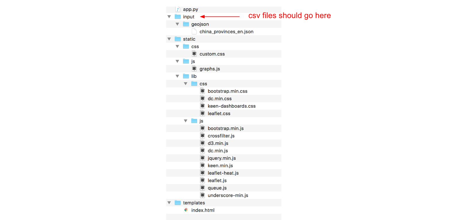
Below is the folder structure of our project.

Note that the only files that we need to create from scratch are:
- app.py: Server side code for rendering html pages and serving data to the browser
- charts.js: Javascript file that will contain the code of our charts and map
- custom.css: css file that will contain our custom css code
We also need to make a few modifications to the index.html. Inside index.html, we need to reference the charts from charts.js.
6. Building the Charts and Map
The source code for the charts and map goes into graphs.js.
We start by using a queue() function from the queue.js library for reading the data from the server and executing the function makegraphs(). The queue() function makes sure that we have all the data transferred to the browser before drawing the graphs.
The makeGraphs() function contains the code for cleaning the data, building the crossfilter dimensions for filtering the data, the dc.js charts and the map. It takes 2 arguments, the first one is error which can be used for handling any error from the the .defer function, and as second argument recordsJson which contain the data that we read from the server.
queue()
    .defer(d3.json, "/data")
    .await(makeGraphs);
function makeGraphs(error, recordsJson) {
.
.
.
};
Inside the makeGraphs function, we start by cleaning the projects data. We change the date type from string to datetime objects, and we set all timestamps' minutes and seconds to 0. We also make sure that the longitute and latitude types are numeric.
var records = recordsJson;
var dateFormat = d3.time.format("%Y-%m-%d %H:%M:%S");

records.forEach(function(d) {
    d["timestamp"] = dateFormat.parse(d["timestamp"]);
    d["timestamp"].setMinutes(0);
    d["timestamp"].setSeconds(0);
    d["longitude"] = +d["longitude"];
    d["latitude"] = +d["latitude"];
});
Next, we create a crossfilter instance.
var ndx = crossfilter(records);
Next, we define data dimensions.
var dateDim = ndx.dimension(function(d) { return d["timestamp"]; });
var genderDim = ndx.dimension(function(d) { return d["gender"]; });
var ageSegmentDim = ndx.dimension(function(d) { return d["age_segment"]; });
var phoneBrandDim = ndx.dimension(function(d) { return d["phone_brand_en"]; });
var locationdDim = ndx.dimension(function(d) { return d["location"]; });
var allDim = ndx.dimension(function(d) {return d;});
Next, we define data groups.
var numRecordsByDate = dateDim.group();
var genderGroup = genderDim.group();
var ageSegmentGroup = ageSegmentDim.group();
var phoneBrandGroup = phoneBrandDim.group();
var locationGroup = locationdDim.group();
var all = ndx.groupAll();
Next, we define the first and last timestamps.
var minDate = dateDim.bottom(1)[0]["timestamp"];
var maxDate = dateDim.top(1)[0]["timestamp"];
Next we define the DC.js charts. The first one is a number that will show the total number of events. The second one is a bar chart that will show the number of events by time. The remaining ones are row charts that will show the data broken down by gender, age segments, phone brands and Chinese provinces.
var numberRecordsND = dc.numberDisplay("#number-records-nd");
var timeChart = dc.barChart("#time-chart");
var genderChart = dc.rowChart("#gender-row-chart");
var ageSegmentChart = dc.rowChart("#age-segment-row-chart");
var phoneBrandChart = dc.rowChart("#phone-brand-row-chart");
var locationChart = dc.rowChart("#location-row-chart");
For each DC.js chart, we pass the necessary parameters.
  numberRecordsND
    .formatNumber(d3.format("d"))
    .valueAccessor(function(d){return d; })
    .group(all);


  timeChart
    .width(650)
    .height(140)
    .margins({top: 10, right: 50, bottom: 20, left: 20})
    .dimension(dateDim)
    .group(numRecordsByDate)
    .transitionDuration(500)
    .x(d3.time.scale().domain([minDate, maxDate]))
    .elasticY(true)
    .yAxis().ticks(4);

  genderChart
        .width(300)
        .height(100)
        .dimension(genderDim)
        .group(genderGroup)
        .ordering(function(d) { return -d.value })
        .colors(['#6baed6'])
        .elasticX(true)
        .xAxis().ticks(4);

  ageSegmentChart
    .width(300)
    .height(150)
        .dimension(ageSegmentDim)
        .group(ageSegmentGroup)
        .colors(['#6baed6'])
        .elasticX(true)
        .labelOffsetY(10)
        .xAxis().ticks(4);

  phoneBrandChart
    .width(300)
    .height(310)
        .dimension(phoneBrandDim)
        .group(phoneBrandGroup)
        .ordering(function(d) { return -d.value })
        .colors(['#6baed6'])
        .elasticX(true)
        .xAxis().ticks(4);

    locationChart
      .width(200)
    .height(510)
        .dimension(locationdDim)
        .group(locationGroup)
        .ordering(function(d) { return -d.value })
        .colors(['#6baed6'])
        .elasticX(true)
        .labelOffsetY(10)
        .xAxis().ticks(4);
Next, we initialize a leaflet map.
var map = L.map('map');
We define a function that will draw the map and adds a layer of heatmap representing the geographical distribution of events.
var drawMap = function(){
map.setView([31.75, 110], 4);
mapLink = '<a href="http://openstreetmap.org">OpenStreetMap</a>';
L.tileLayer(
'http://{s}.tile.openstreetmap.org/{z}/{x}/{y}.png', {
attribution: '© ' + mapLink + ' Contributors',
maxZoom: 15,
}).addTo(map);
//HeatMap
var geoData = [];
_.each(allDim.top(Infinity), function (d) {
geoData.push([d["latitude"], d["longitude"], 1]);
});
var heat = L.heatLayer(geoData,{
radius: 10,
blur: 20,
maxZoom: 1,
}).addTo(map);
};
We call drawMap() function to display the map.
drawMap();
Next we define the rules for updating the map. The code below makes sure that anytime we filter any DC.js charts, we redraw the map with the new filtered data.
dcCharts = [timeChart, genderChart, ageSegmentChart, phoneBrandChart, locationChart];

_.each(dcCharts, function (dcChart) {
    dcChart.on("filtered", function (chart, filter) {
        map.eachLayer(function (layer) {
          map.removeLayer(layer)
        });
    drawMap();
    });
});
And finally, we call the dc.renderAll() function for rendering all the charts.
dc.renderAll();
Inside the index.html file, we have to reference all the charts that we defined in the charts.js file. For example, if we want to show the timeline chart, we have to add the line below to the index.html file.
<div id="time-chart"></div>
Conclusion
In this tutorial, we learned how to build an interactive data visualization of geospatial data by combining DC.js charts with Leaflet.js. If you liked this tutorial, we might want to check a similar one where I used MongoDB as a data source instead of csv files.
Go Top